Manekineko Street Ratchada
Retail
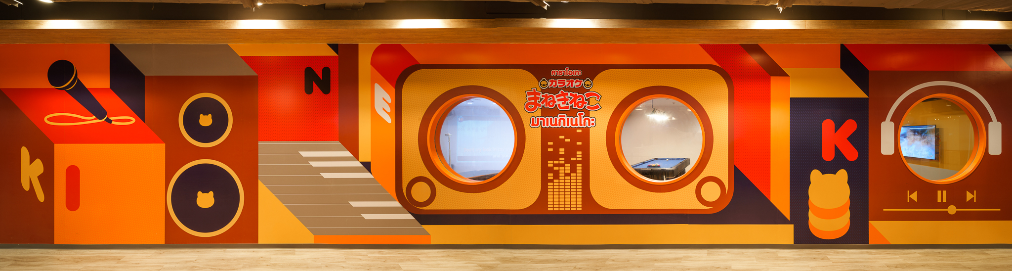
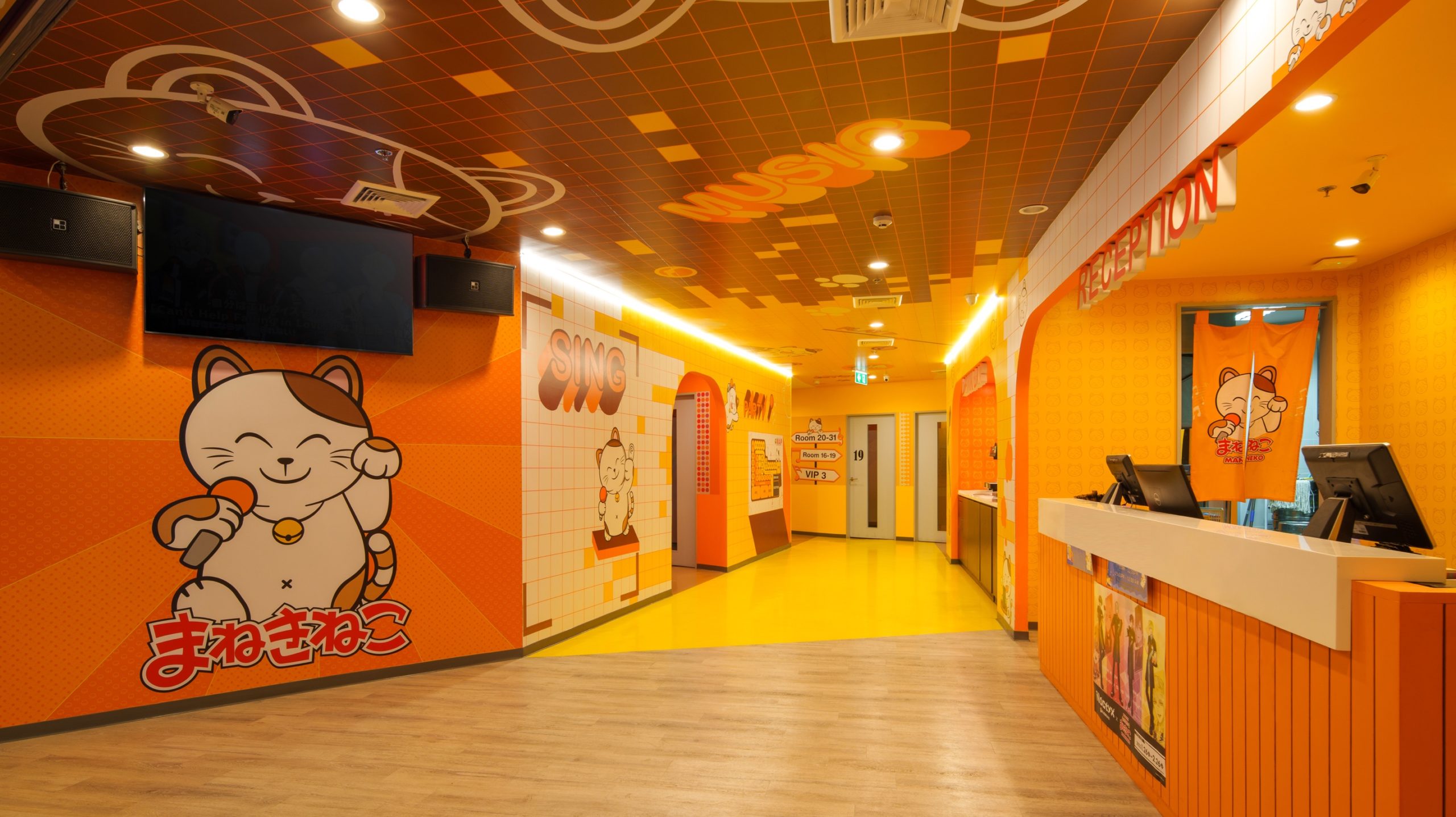
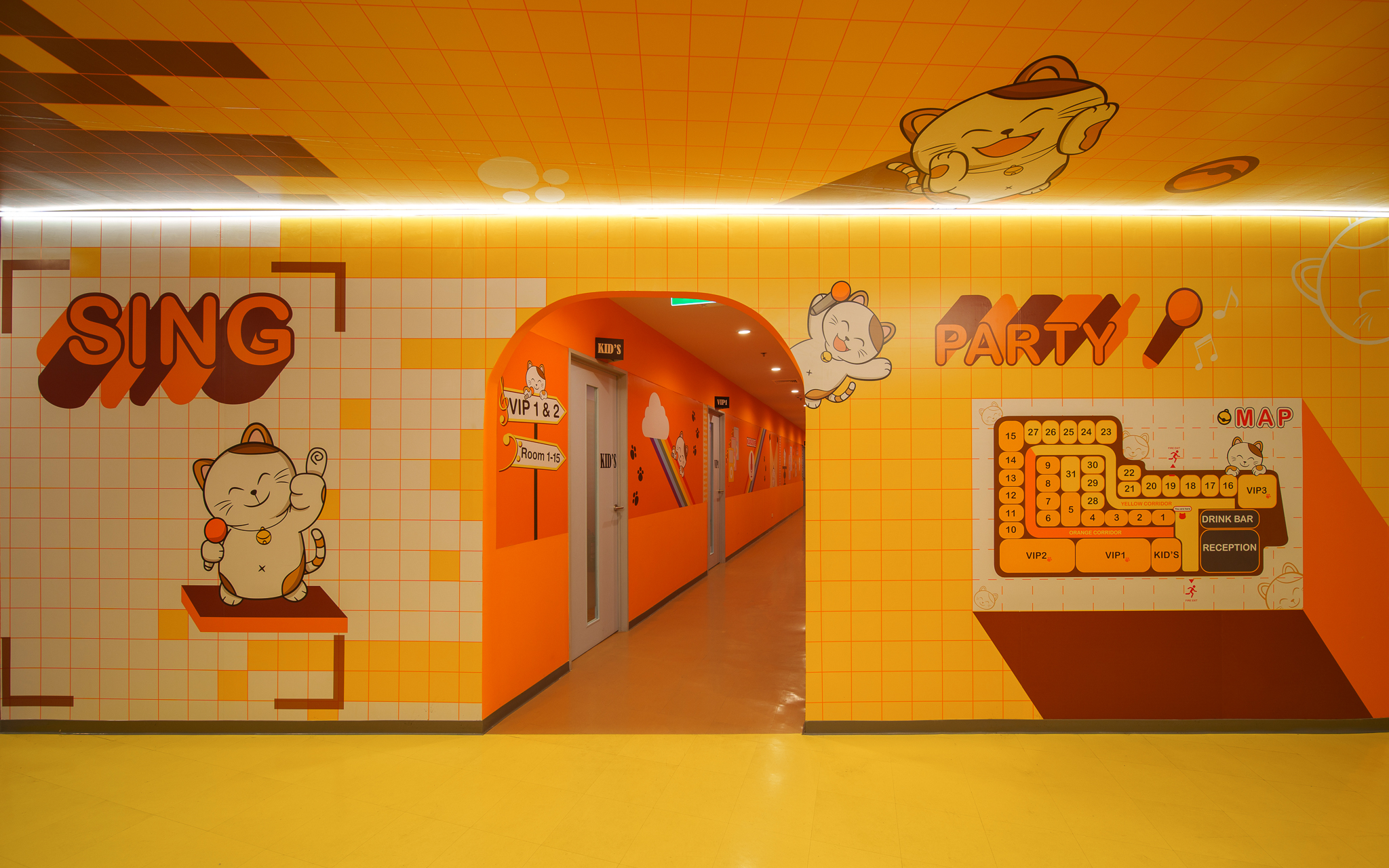
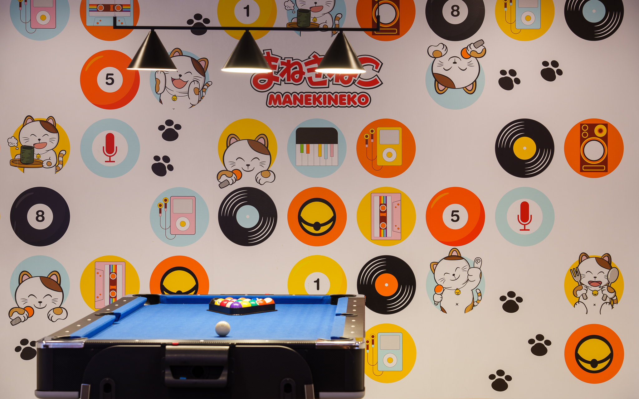
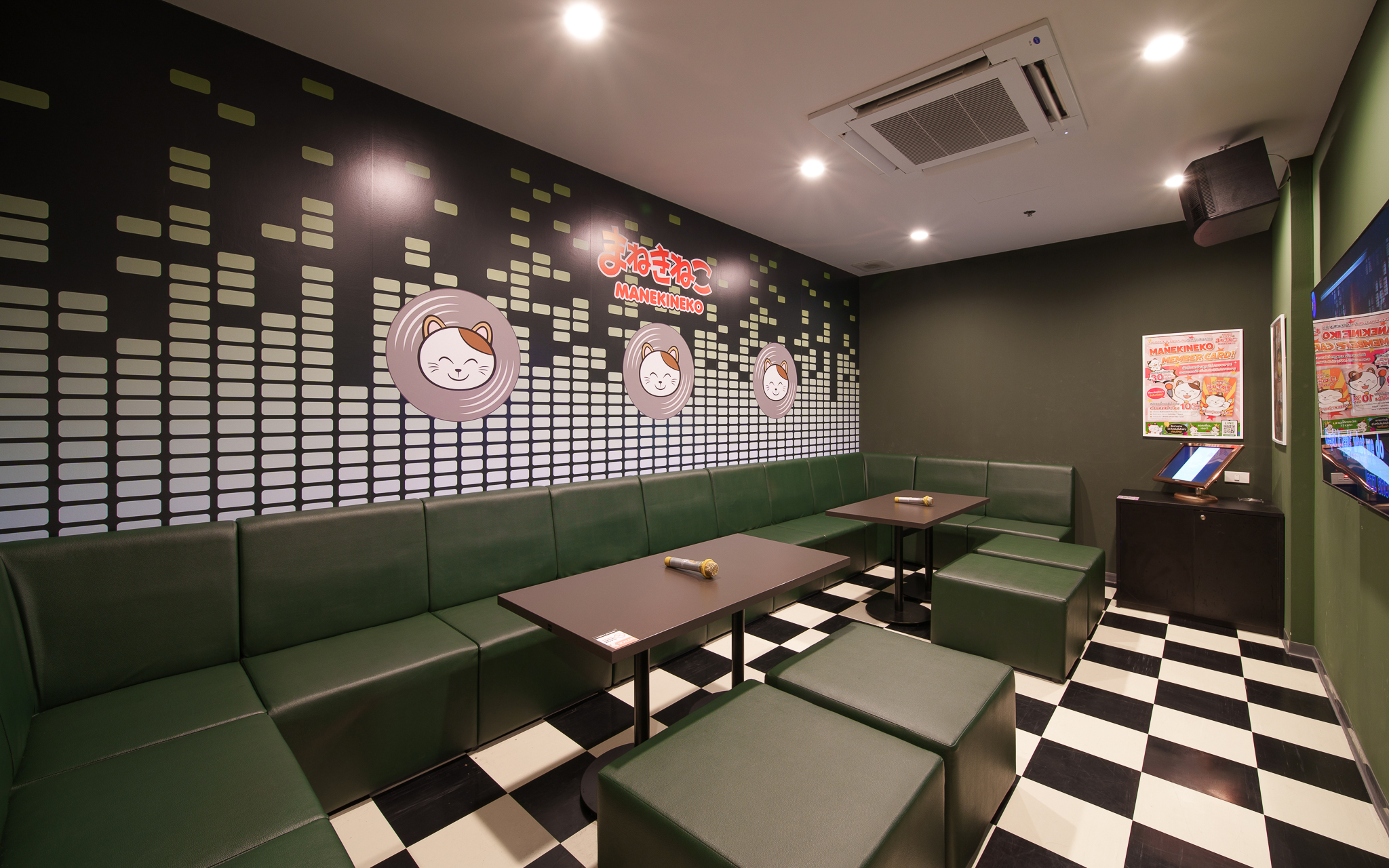
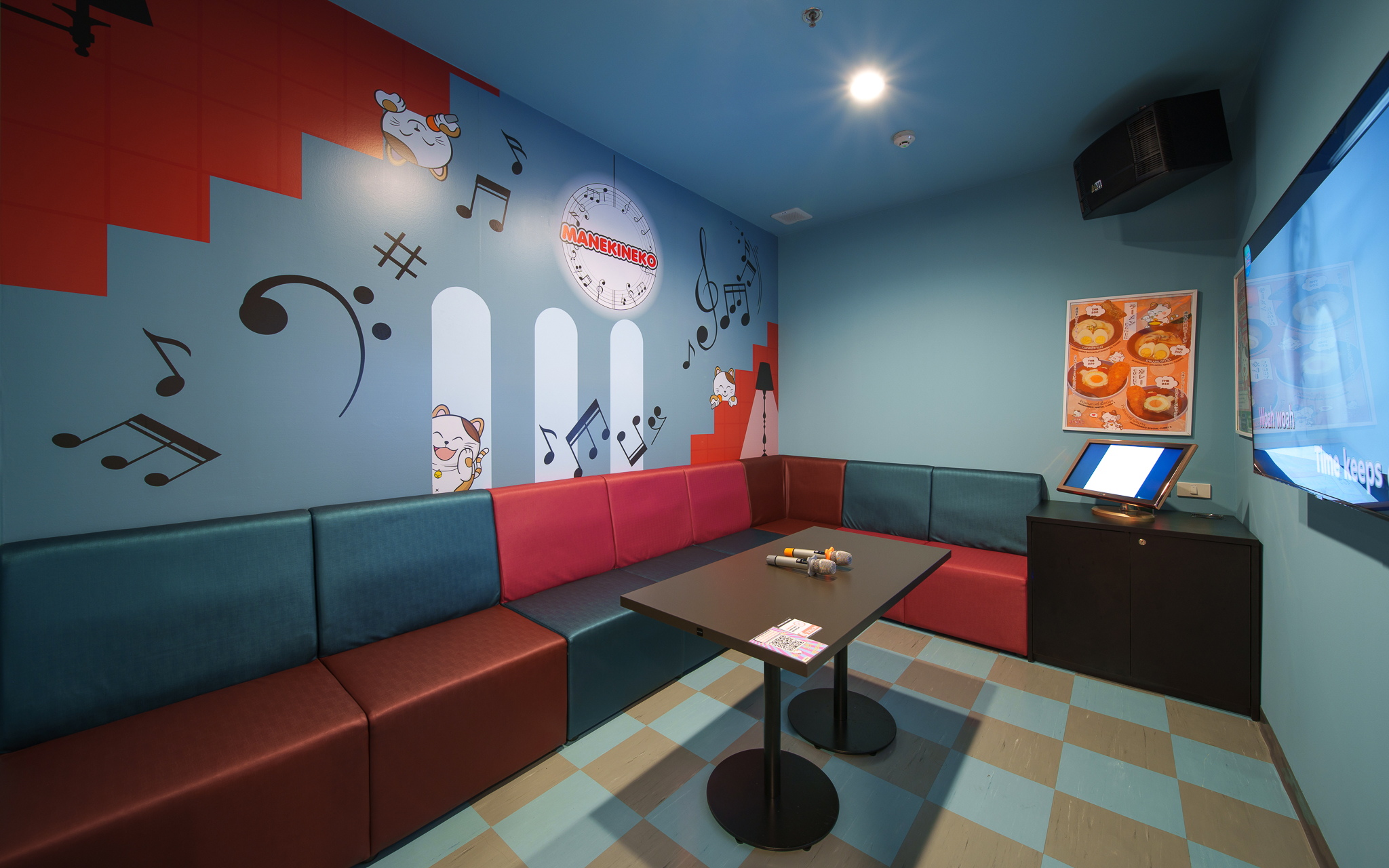
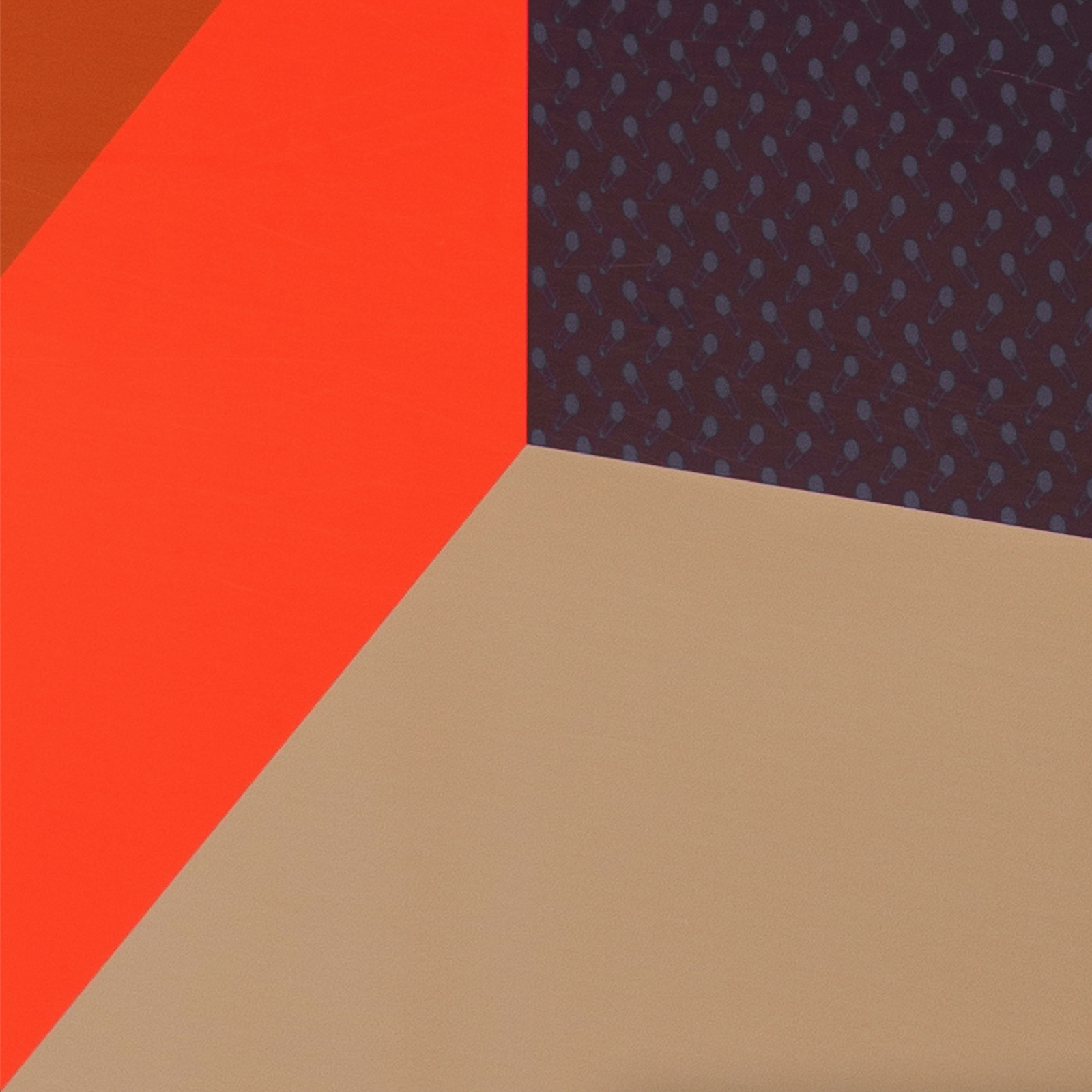
Most of the stores of Karaoke Manekineko, a chain in Japan, have a cutesy direction with pastel palettes or primary colors that are conscious of targets such as families, female, and children. For the Street Ratchada store this time, we proposed a conversion to a new direction using a slightly mature atmosphere targeting of working adults. We aimed to create a space where the combination of colors and repeated motifs convey the joy of music itself.
EN
日本語
日本でチェーン展開するカラオケまねきねこの店舗のほとんどは、家族連れや女性、子供などのターゲットを意識したパステルトーンや原色を中心としたファンシーな方向性にあった。今回我々がストリートラチャダ店をお手伝いするにあたり、社会人ターゲットも視野に入れた、やや大人な雰囲気を使った新しい方向性への変換を提案した。色使いの組み合わせやリピートされるモチーフ達が音楽の楽しさそのものを伝えるような空間を目指した。

Client : Koshidaka Thailand Co., Ltd.
Interior Design : FAST SPACE DESIGN CO., LTD.
Interior Decoration : FAST SPACE DESIGN CO., LTD.
Photos : Behype Perspective
Design Director : Ryosuke Ebisawa
Project Lead : Onwanya Kingkaew